CLIENT: Minneapolis St. Paul International Airport
BACKGROUND:
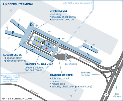
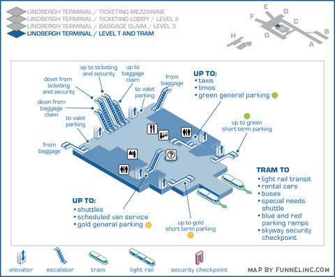
An airport is a confusing place with the added element of people in a hurry. This client needed to solve multiple areas of confusion since they have various terminals, train systems and parking garages burdened by an odd layout and two separate terminals with no clear relationship. Their existing maps were flat, two dimensional and lacked the clarity a three dimensional approach provides.
ASSIGNMENT:
Our first task was to create 39 separate maps for travelers using their website. Using research based on field observations and staff interviews, all of the concourses, terminals, parking options and task-based maps were visualized from the most appropriate vantage point.
Special attention was paid to custom icons, multiple levels and differentiating the two train systems. Another key goal was to create a group of layered map files that could be used in future formats, such as kiosk directories, printed maps and mobile phone applications.
FULL PROJECT:
To see the maps in action, go to this link.
|